RIOX Shopping Experience Checkout Redesign | Native Mobile
Problems Solved:
• Low behavioral KPIs (high time on task, error rate, drop rate, cart abandonment).
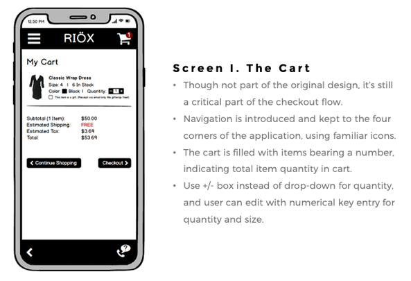
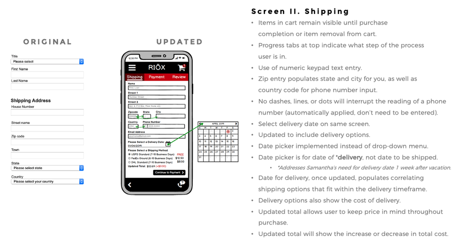
• Simplify and streamline checkout process and reduce number of actions, text input fields, and menus.
• Create new shopping cart design leading into checkout process.
Goal: Redesign mobile checkout process for users "on the go", reduce errors, enhance usability.
Roles: Research, User Flow, Information Architecture, UX/UI Design.
Preliminary Research and Information:
RIOX is a new online shopping application targeting 25-to-40-year-olds with disposable income and an interest in fashion. The existing checkout flow was lengthy and riddled with opportunities for error, frustrating users and leading to high drop/abandonment rates. Users submit a high number of support requests and negative feedback on review websites.
Baseline findings of an audit of the existing checkout process included the following:
|
•Long form, too much scrolling – can’t see errors or vital information.
•No real hierarchy. •High number of text fields. •No contrast between items + actions. •No sense of position/progress in checkout process. •No navigation options except to continue (at end). •No phone number + email input for contact. •No auto-fill, location-sharing, or API/Fetching. •Inconvenient/awkward use of drop-down menus. •No indication of field errors. •No way to differentiate field errors if they occur. •Up/down buttons for CC and CVV fields unnecessary. •No “same as shipping address” option. •No review of order. |
•Only one payment method available + no type detection.
•House number + street address input mislabeled. •Cart + number of items is not visible. •No visible price/updates as you alter input. •No ability to request help with process. •No shipping choices provided. •No gift options for shipping. •No edit/update information action obvious. •No personality; no suggested content or invitation. •High-friction experience; poor input methods + choices. •Only action is to “Continue”… to what? •Random use of capitals + lowercase label text strings •Boring and bland: No color, visuals, etc. •No branding, no site/store identification. |
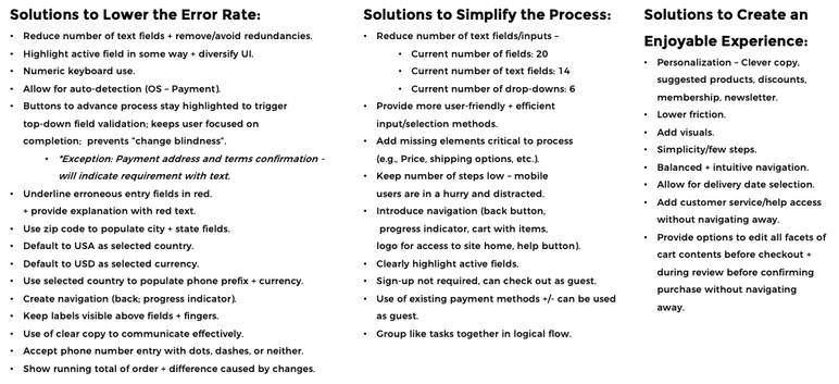
Meeting 3 Primary Goals of Redesign: Lowering Error Rate, Simplify Process, Enjoyable UX:
UX Principles Leveraged to Meet Primary Goals of Redesign
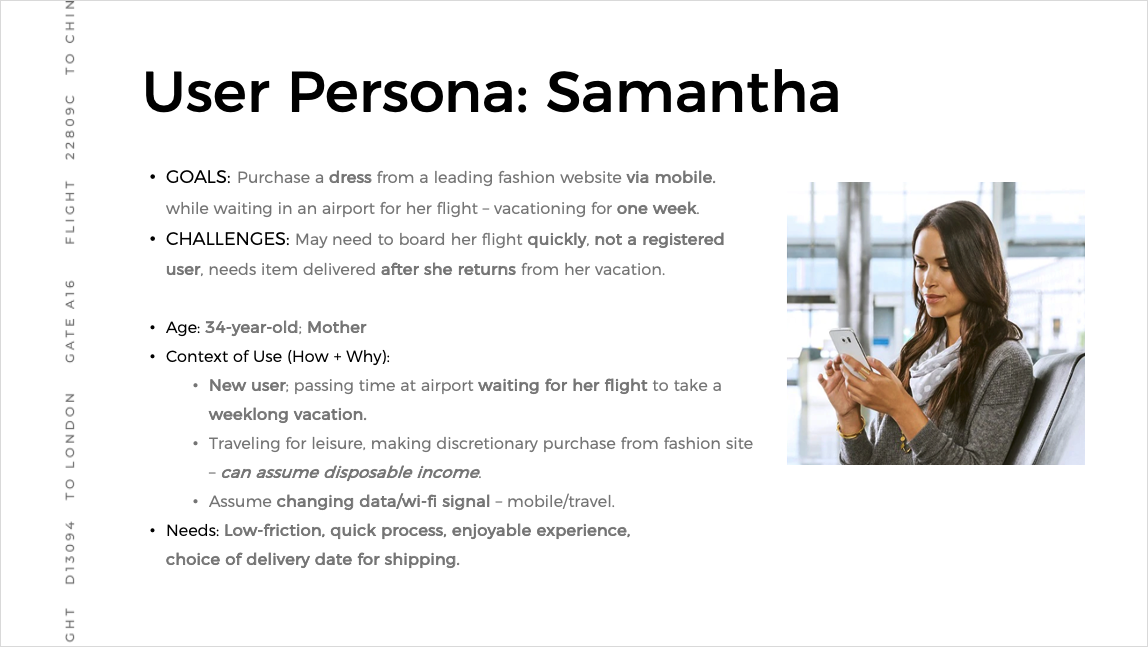
Personas were developed based on a sample of current users and approximations of their demographic data as provided by the client, in addition to information in the project brief. *Empathy maps and journey maps were built based on a sample of 3 in-vivo testers (*not seen here).
Example User Persona
Structural Components:
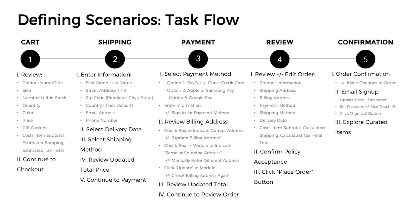
The existing User Flow (task flow) was reviewed and reconstructed prior to creating mid-fidelity wireframes with reference to areas of reported difficulty navigating and high (negative) behavioral KPIs.
The Information Architecture was informed by the reconstructed flow and reviewed by the aforementioned 3 in-vivo test subjects for approval.
Finalized User Flow for RIOX Checkout Experience
Wireframes, Testing, and Feedback:
After quickly drafting paper wireframes, mid-fidelity wireframes/mocks were created in Balsamiq. User testing was not within the scope of this project, and was conducted offsite.
After quickly drafting paper wireframes, mid-fidelity wireframes/mocks were created in Balsamiq. User testing was not within the scope of this project, and was conducted offsite.
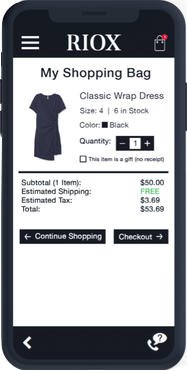
Mid-fidelity Wireframe to Kick-off Checkout Process, Screen 1: Cart
Mid-fidelity Wireframe Screen 2: Shipping
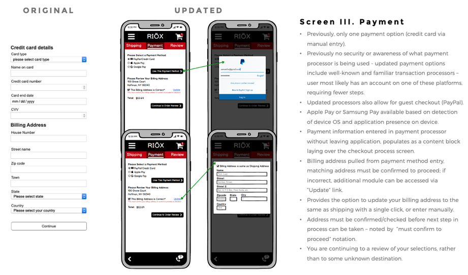
Mid-fidelity Wireframe Screen 3: Payment
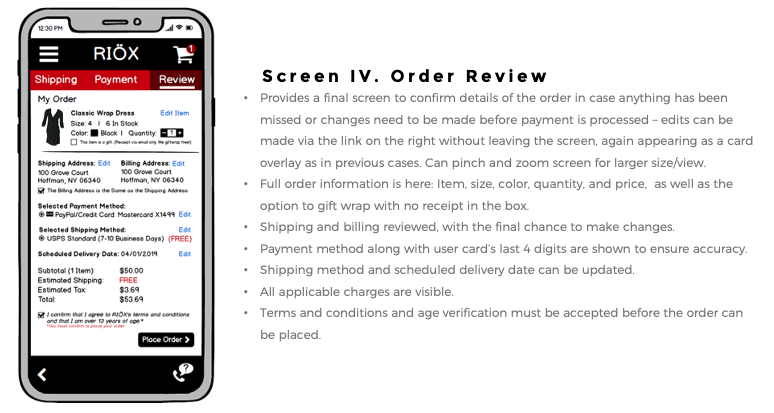
Mid-fidelity Wireframe Screen 4: Review Order
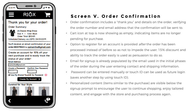
Mid-fidelity Wireframe Screen 5 (Final): Order Confirmation
Developer Hand-off, Management, and Implementation:
Developer hand-off and management were outside the scope of the project. Wireframes and documents were provided to business owners to implement along with their visual design and development teams.
User Feedback, Evaluation, and Suggested Considerations for Improvement:
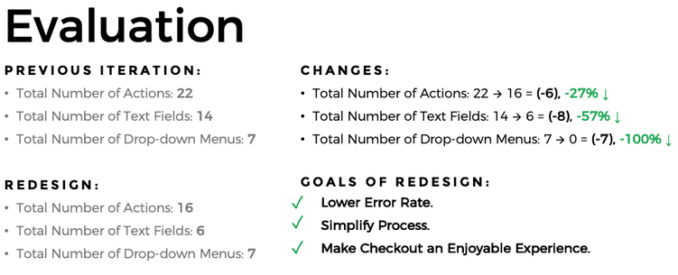
• Using comprehensive UX design principles, reducing the number of actions required, text fields, drop-down menus, and removing the necessity of scrolling on each part of the form, as well as integrating additional options within the design created a more enjoyable, personal, and interactive experience that a user can engage with quickly, easily, and with a lower rate of error.
• Client feedback was highly positive, particularly with regards to the concept of "one screen per key action".
Considerations for improvement include increased button and CTA size, and potential use of scrolling for greater inclusion of negative space to reduce visual "noise" and lower cognitive load.

