Rhabit Analytics | Responsive Web Application
Problems Solved:
• User uncertainty surrounding navigation and resource access.
• Poor behavioral KPIs (high time on task, error rate, and drop rate; low engagement).
• Low attitudinal KPIs (NPS, CSAT, qualitative feedback).
• Updated interface to reflect growth-oriented experience and easy-to-understand data visualizations.
Goal: Create a more inviting user interface that rotates with seasons (quarterly) and allows employees to track their growth at work, provide feedback to coworkers, and engage with learning content to enhance their abilities with ease, understanding, and an ongoing desire to engage.
Roles: "Design team of one"; Research, UX/UI Design, (Re-)Branding/Style Guide, I/A, Layout, and Illustration.
Preliminary Research and Information:
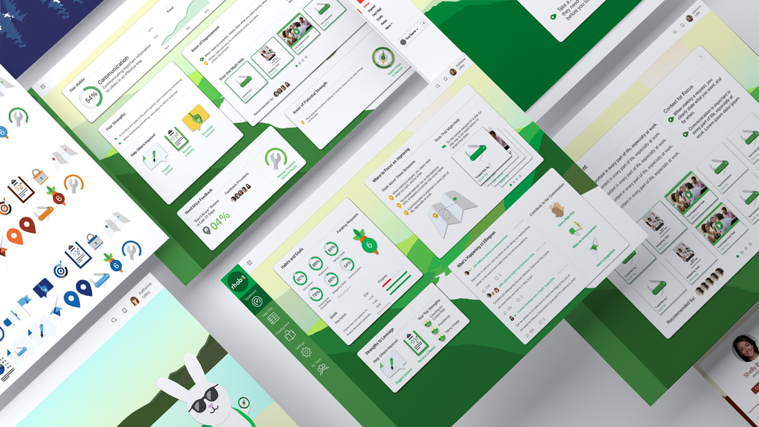
Rhabit is a tool that allows users to give and receive feedback on observable workplace behaviors and access learning and development resources to grow skills. Management and HR can also access employee data and generate reports on individuals, teams, departments, and more. Behavioral/skill ("habit") ratings are given based on yes/no/did not observe responses from peers, provided in card format and swiping or clicking in the corresponding direction of the intended selection.
Baseline findings of an audit with reference to analytics tools showed a low use/engagement rate, lower-than-desired NPS scores, and unsatisfactory behavioral KPI scores. Additional qualitative feedback from on-site users highlighted the negative emotional experience of raw quantitative behavioral scores and lack of understanding around features to access learning content and team support.
This information prompted a desire to create a new user experience. I began by proactively creating presentations for the Rhabit team to increase understanding of the importance of a strong user experience, which were successfully leveraged to redesign the entire application.

Stakeholder Conversations and Takeaways:
After conversations with leadership, I delivered 2 workshops on the importance of UX and reviewed the existing metrics I had documented earlier.
The first workshop provided leadership and our development team examples of how to mitigate existing problems and improve both design and function based on an empathic understanding of user needs.
The second workshop shared statistics and examples of the ROI of investing in an excellent user experience. I also presented qualitative feedback from users within our co-working space, ultimately providing both the practical and emotional impact necessary to move away from an "MVP" (minimum viable product) approach and onboard the team to value of design beyond its use in marketing. The suggested redesign project was green-lit by management afterward.
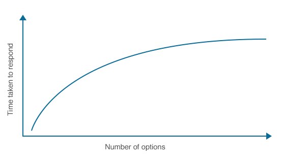
Example of UX workshop principles: Hick’s law states that the time it takes for users to make a decision increases as the number of choices offered increase.
Personas were developed based on a diverse sample of current users and approximations of their demographic data, in addition to brief conversations with onsite users. Empathy maps and journey maps were constructed based on the aggregate of the aforementioned research.
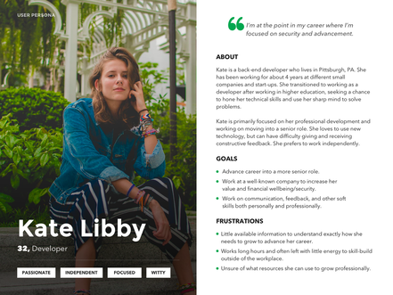
Example User Persona
|
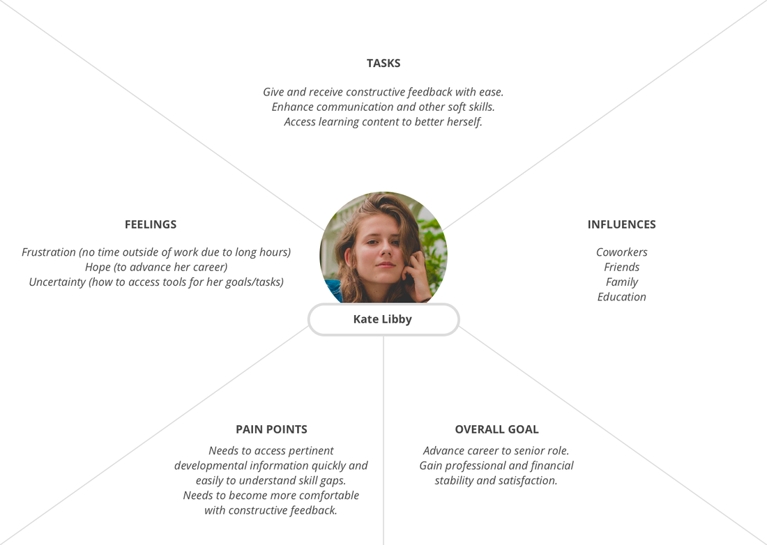
Example Empathy Map
|
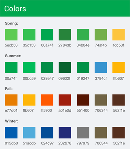
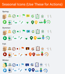
Style guide development began with considering the ultimate goal of the application: employee skill-building. Considering that, as well as the potential adoption by larger enterprise clients that examine their metrics on a quarterly basis, I opted to create a seasonally-rotating UI theme that accompanies the business quarters based in nature. Icon and symbol development grew organically, rooted in the idea of a "journey through nature", using symbols such as a compass, a map, etc.
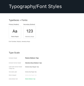
Color palettes for each season were pulled directly from nature as well, using high-definition photos of landscapes, flora, and fauna (such as the bright blue of a poison dart frog) to source colors and shades with mindfulness to contrast for accessibility. Typefaces also received an update for enhanced readability.
Icons, colors, backgrounds, buttons, and fonts were reviewed with developers throughout the style guide construction to ensure they could be implemented.
|
|
|
Example Style Guide Components
Structural Components:
The existing *User Flow was reviewed and reconstructed during the initial sketching of wireframes with reference to areas of reported difficulty navigating and high (negative) behavioral KPIs. Few changes were made to the user flow, with the exception of additional content.
The *Information Architecture was informed by the reconstructed flow and qualitative onsite user interviews using a method similar to card sorting with an optional active comparison to the current state of the application.
*User Flow and Information Architecture images unavailable.
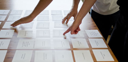
Card Sorting Exercise to inform Information Architecture
Wireframes, Testing, and Feedback:
Color was applied to paper wireframes after black and white completion to provide a basis for digital mocks. User testing was conducted after 2 different mockup sets were built (one with existing iconography and only partial architectural and layout changes, one with custom icons and a complete architectural and layout overhaul).
Color was applied to paper wireframes after black and white completion to provide a basis for digital mocks. User testing was conducted after 2 different mockup sets were built (one with existing iconography and only partial architectural and layout changes, one with custom icons and a complete architectural and layout overhaul).
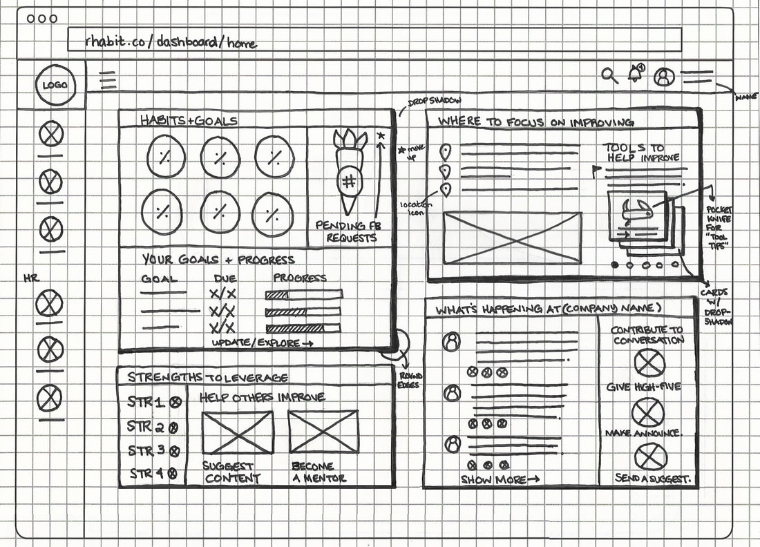
Paper Wireframe of Final Home Dashboard
|
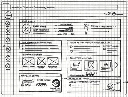
Paper Wireframe of Final Habit Deep Dive
|
15 Active users were interviewed in-vivo using an A/B testing method using digital mockups. The feedback indicated a greater preference for partial layout updates, restructured navigation, and the natural color palette, as well as the UI and symbols centered around the theme of a growth-oriented journey.
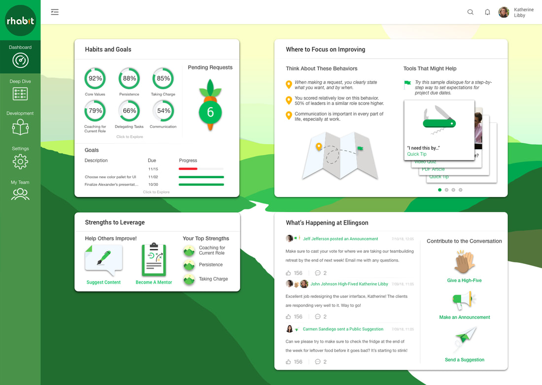
High-fidelity Mockup of User Dashboard with Collapsed Left Navigation
|
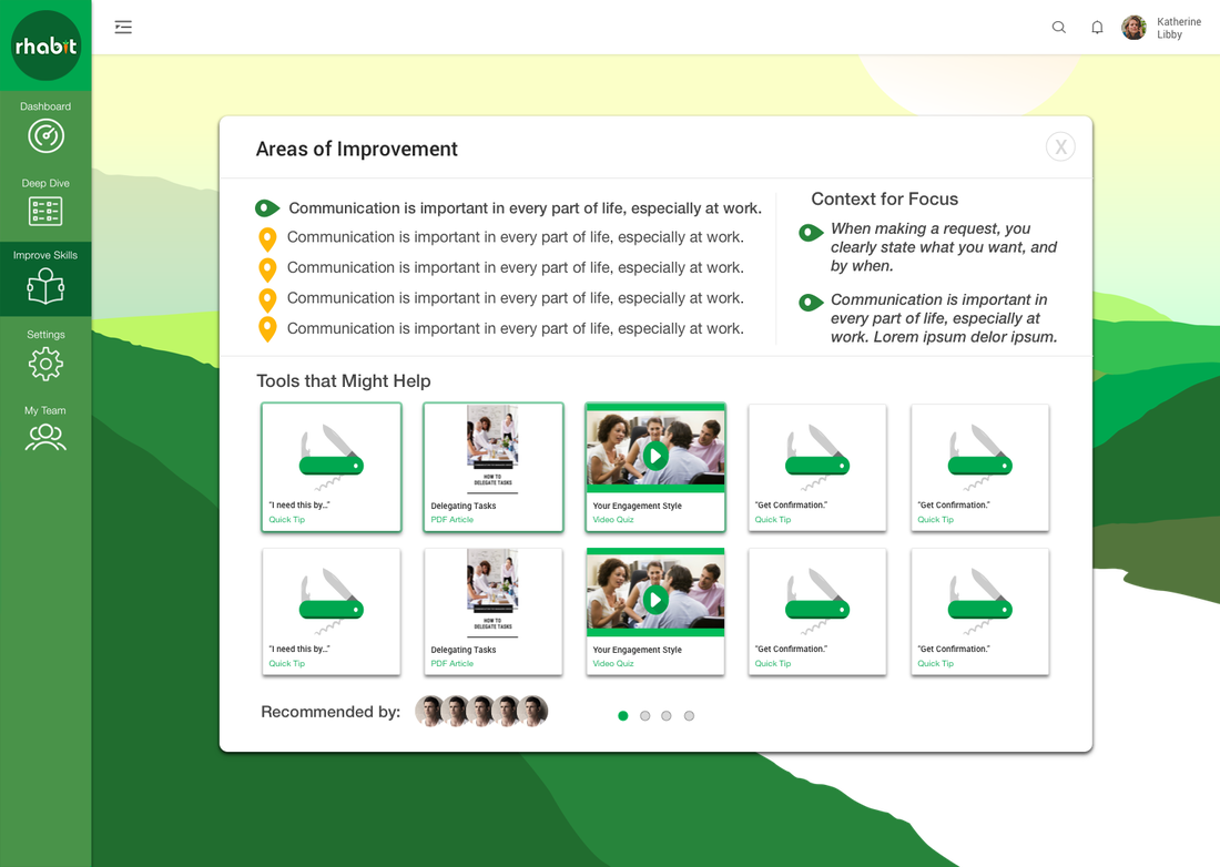
High-fidelity Mockup of Learning + Development Content Page
|
High-fidelity prototypes were tested with 12 users who largely indicated a preference for a collapsing condensed left navigation on desktop (interaction/animation), and a genuine delight with the seasonal designs and newly added illustrations that greet a user upon completion of the habit (behavioral) rating flow.
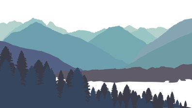
Winter Season/Quarterly Background Theme
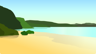
Summer Season/Quarterly Background Theme
|
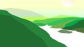
Spring Season/Quarterly Background Theme and Task Celebration Illustration
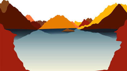
Autumn Season/Quarterly Background Theme
|

Developer Hand-off, Management, and Implementation:
Working closely with a small team of developers, there was a high level of direct communication and collaboration throughout the build and implementation process, including delivery of specs and documentation.
Working closely with a small team of developers, there was a high level of direct communication and collaboration throughout the build and implementation process, including delivery of specs and documentation.
User Feedback, Evaluation, and Suggested Considerations for Improvement:
• User feedback after redesign implementation was largely positive from onsite users, as anticipated based on earlier testing.
• Time on task, error rate, and drop rate decreased. Engagement with the application increased based on number of active users, sign-ins, and ratings that occurred weekly.
NPS and CSAT scores required a longer period prior to evaluation to yield any meaningful or conclusive data. Additional outcomes included increased interest from investors and conversion of enterprise clients from pilot to full adoption, particularly when their organization's custom branding elements were applied to the new UI.
Considerations for improvement include adding animations and interactions, such as a moving paper airplane or high-five when a user submits a suggestion or gives a teammate a "high-five" using the interactions available on the bottom right of the application. Brief onboarding tutorials for new users or other more complex functions accessible by HR or managers would also be useful. I might also resize certain elements for greater balance.